Select & Combobox
Easy Forms provides both native select dropdowns and Alpine.js-powered, styleable, searchable combobox components for single and multiple selection.
Select Field (Native Dropdown)
By default, the Select fieldtype uses a standard HTML select dropdown:
yaml
handle: simple_select_field
field:
  options:
    -
      key: option1
      value: 'Option 1'
    -
      key: option2
      value: 'Option 2'
    -
      key: option3
      value: 'Option 3'
    -
      key: option4
      value: 'Option 4'
  type: select
  display: 'Simple Select Field'
  instructions: 'A simple select field.'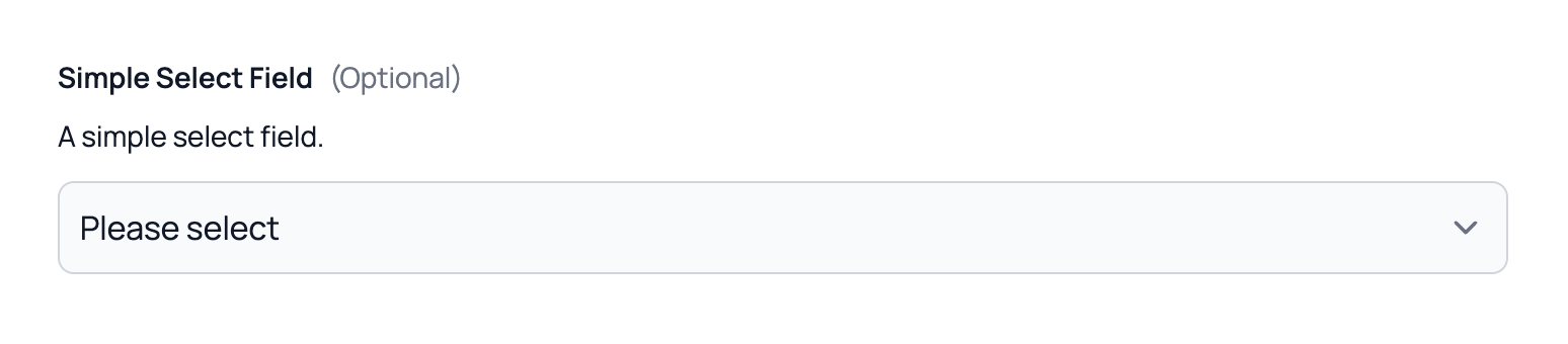
You can also set the multiple option to true to allow multiple selections using the native HTML multiple select field.
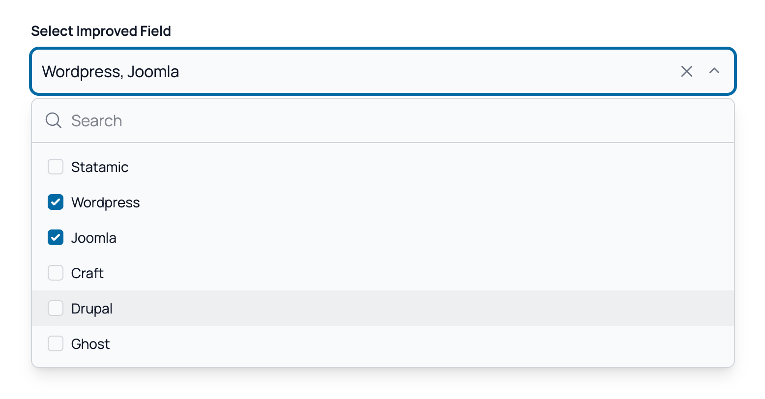
Combobox (Searchable Select)
For a better user experience, Easy Forms provides a styleable, searchable combobox component. To use it, simply enable the Enable Improved Fields option located at the bottom of the field configuration.
This field uses Alpine.js and offers the following features:
- Instant Search: Enable the "Searchable" option to filter options instantly.
- Multiple Selection: Support for single or multiple selection via the
multipleoption. - Maximum Selection: Respects the maximum number via the
max_itemsoption. - Clearable Values: Allow users to clear their selection by enabling the "Clearable" option.
- Keyboard Navigation: Full keyboard support for accessibility.
- Themable: Fully customizable using Tailwind CSS.