Date Picker
Easy Forms includes an advanced date picker component with support for single date selection, date ranges, and various constraints.
To use it, add a text field to your blueprint, set the input_type to date, and enable the improved_field option in the Easy Forms configuration section. For example:
yaml
handle: date_field
field:
  input_type: date
  type: text
  display: 'Date Field'
  improved_field: true
  placeholder: 'Please select a date'
  instructions: 'This field uses the "date" input type.'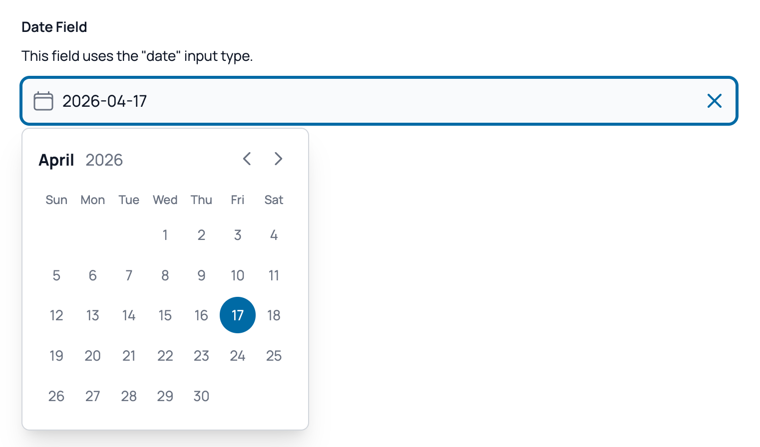
The datepicker is built using Alpine.js and offers single date or range selection, along with full keyboard navigation support.
Additional config options
The following options are available in the "Easy Forms" section of the field configuration:
| Option | Type | Description |
|---|---|---|
| Date range | Toggle | Enable to allow users to select a date range instead of a single date. |
| Max range | Integer | The maximum number of days allowed when range mode is enabled. |
| Minimum date relative to today | Integer | Set to 0 to use today as the minimum date, or a positive/negative integer to add/subtract days from today. |
| Maximum date relative to today | Integer | Set to 0 to use today as the maximum date, or a positive/negative integer to add/subtract days from today. |
| Minimum date | Date | The specific minimum date allowed in the datepicker. (Ignored if "Minimum date relative to today" is set). |
| Maximum date | Date | The specific maximum date allowed in the datepicker. (Ignored if "Maximum date relative to today" is set). |
| Don't close after selection | Toggle | If enabled, the datepicker will remain open after the user selects a date. |